
Navigation Menu Redesign
Website link (menu is currently active)
During my position at Brentwood Baptist, I redesigned the navigation menu used on all campus websites, to better achieve our organization’s website goals and create a clearer user experience.
Acting as a UI/UX Designer on this project, the technical work was a solo effort.

The menu is now in production across all campus websites, helping thousands of visitors weekly to better navigate the sites.
Case Study
The Problem
Our old navigation menu had been in place for many years, but over time, many submenus were becoming cluttered and difficult to navigate.
Offering up to 10-12 choices at once can overwhelm users, and our previous analytics audits frequently reveal that too many choices leads to lower clickthrough rates on every page we examined.

In addition to devision overload, many navigation options for ministries and resources lacked any context for first-time visitors, an important demographic that the websites serve.
And to top it off, the menu was very clunky on mobile—which comprised about 70% of all of our website traffic—featuring small fonts, tight spacing, and unclear iconography.

So, after documenting my initial findings, I consulted with the Digital and Communications Team leadership to put together a refresh project, taking on the responsibility of updating the menu to our contemporary high standards.
The Process
Research
First, I carefully reviewed our analytics data, examining heatmaps, scrollmaps, clickthrough rates, bounce rates, and quick-back rates. These numbers helped paint pictures of how the menus were being used, and how they contributed (or sometimes detracted) from the experience.
It became clear that minimizing miss-clicks (or taps), increasing clarity, and reducing decision fatigue were the biggest concrete improvements to aim for.

After consulting our analytics data, I then moved on to competitor research, examining close to a dozen other church website navigation menus, auditing each one based on simplicity, ease of use, and feature set.
A great opportunity would be to incorporate usability tests, interviews, or a focus group, to incorporate more qualitative data into our decision-making process. However, these processes were outside the scope of the project and means available to the team.
At the end of my research phase, I had a wealth of design feature improvements to implement, based on concrete data and existing solutions.
Design
Now, it was time to put my research into action.
I created mockups of our existing homepage layouts for mobile and desktop, and then I set up Figma components to create the foundational parts for the menu.

Using Figma’s helpful Component and State Change features was instrumental in keeping the complexity to a minimum, while also allowing for the most flexibility. This had the added benefit of making the prototype feel “native” and natural.
There were multiple iterative rounds, incorporating feedback from leadership along the way, to successively improve the design.
There were a few problems that arose around this time as well.
More Problems
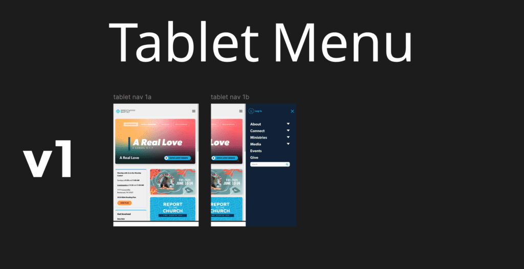
1. Space In the Wrong Place
In the first “v1” version of the mobile menu, the whitespace at the top of the page was overly constricting on smaller screen sizes, and the “Login” button was very difficult to see.
In future versions, the menu was instead configured to occupy all of the former whitespace at the top of the screen, maximizing the viewing size. The “Login” button was also moved towards the top and given the accent color to stand out visually.

2. CSS Styling Headaches
Next, the “Log In” page was styled completely differently from our website—it didn’t match our organization’s branding at all, which is very confusing for our users.

This was solved by conducting additional research and creating a custom CSS file to restyle the page, incorporating our colors and fonts to match the rest of our web presence.
3. Engagement Woes
Finally, in the first three iterations of the desktop version, the “Login” and “Search” options never appeared to be in an intuitive location, and they were difficult to access.

Both of these functions are very important, related to two of our long-term Digital Team goals—to increase the user engagement across our sites, and to encourage logged-in, personalized website experiences.
It took multiple rounds of feedback to get this right, requiring a totally different approach.
The solution was creating a new bar on the top, wholly dedicated to the “Login” and “Search” functions.
These are both highly prioritized website actions for our visitors, and featuring them more prominently simultaneously increases the ease of finding information and the engagement value of the sites.
The Results
After fixing the core issues I encountered, and incorporating multiple rounds of feedback, the project received the final sign-off from the Digital Team to go into production. I sent the design over to our developer, and the new menu was implemented across all campus websites.
Possible Opportunities
Although we have qualitative perspectives on the new website menu, the data is more anecdotal than concrete. Again, conducting more thorough research, before and after the project, would be a great opportunity.
While we have analytics data, this is used more for making per-page decisions than for rating the effectiveness of larger changes site-wide. Conducting deeper quantitative analytics research is beyond the scope of our team’s operations, but it would be great to validate or challenge design decisions to continue positive growth.
All in all, this was a great project that allowed me to take on a large-scale UX project by myself, manage multiple stakeholders and design goals, and dive deep into prototyping with an iterative design process!


One Comment
Comments are closed.