
Printing Web/iOS App Redesign
On this project, I led a 3-person team on a redesign of our Lipscomb University printing web app, serving the role of Lead UI/UX Designer, and Frontend Developer.
Case Study
The Problem
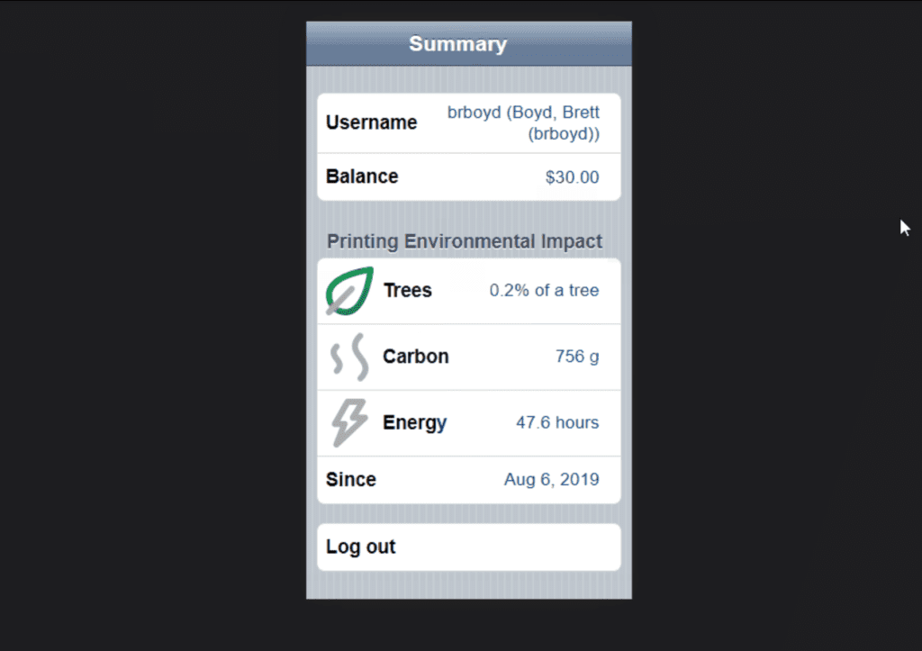
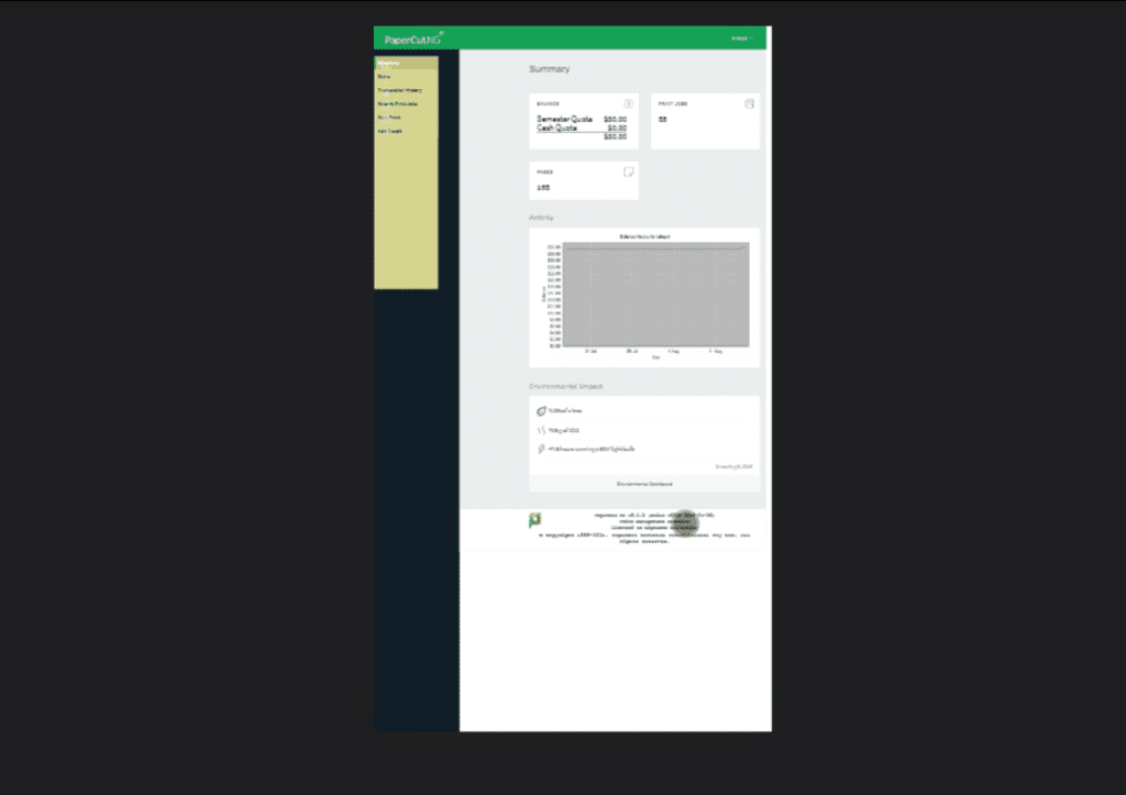
My university’s printing dashboard was tragically clunky and stupendously confusing to use, and these feelings were greatly amplified for mobile device users.
This interface sprawled across several pages, featuring unintuitive button placement, redundant data displays, and a disconcerting lack of visual continuity and symmetry.
There was also an unfixed bug that triggered an error if attempting to print more than one copy.
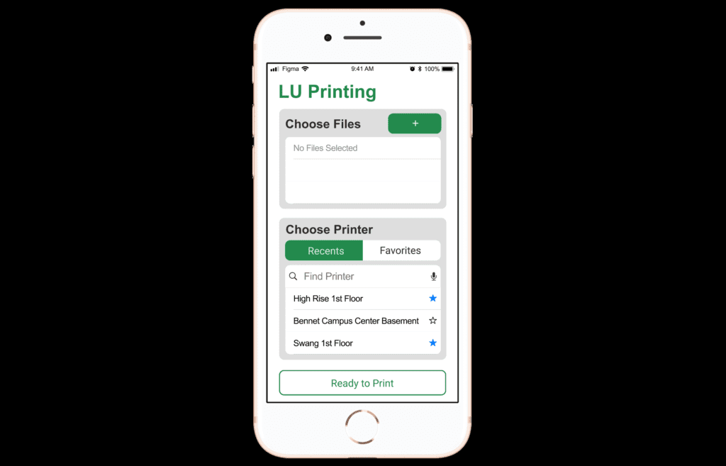
Furthermore, the “mobile version” of this interface was a single, outdated-looking page that prompts the user to log out or View in Desktop Mode—both of which are pretty underwhelming choices that cause frustration.
So, in our UI Design class, my team challenged ourselves to see if we could create a better version, since we had a keen understanding of the problems at hand.
The Process
Throughout the next semester, our team collaborated to design a more streamlined and user-friendly printing dashboard, with a special focus on mobile users.
Research and Analysis
We began with analyzing competitor apps and pages, as well as auditing the current solution to determine a complete feature set.
Our means for research were pretty limited, but we were also very knowledgeable about the core frustrations of the interface, being firsthand users of the software ourselves.
Access to analytics data or resources to conduct more in-depth interviews would have been an excellent way to bolster our research phase, but this was beyond the scope of our resources at the time.
First Design
With our research complete, we created a first version in Figma, based on our findings.
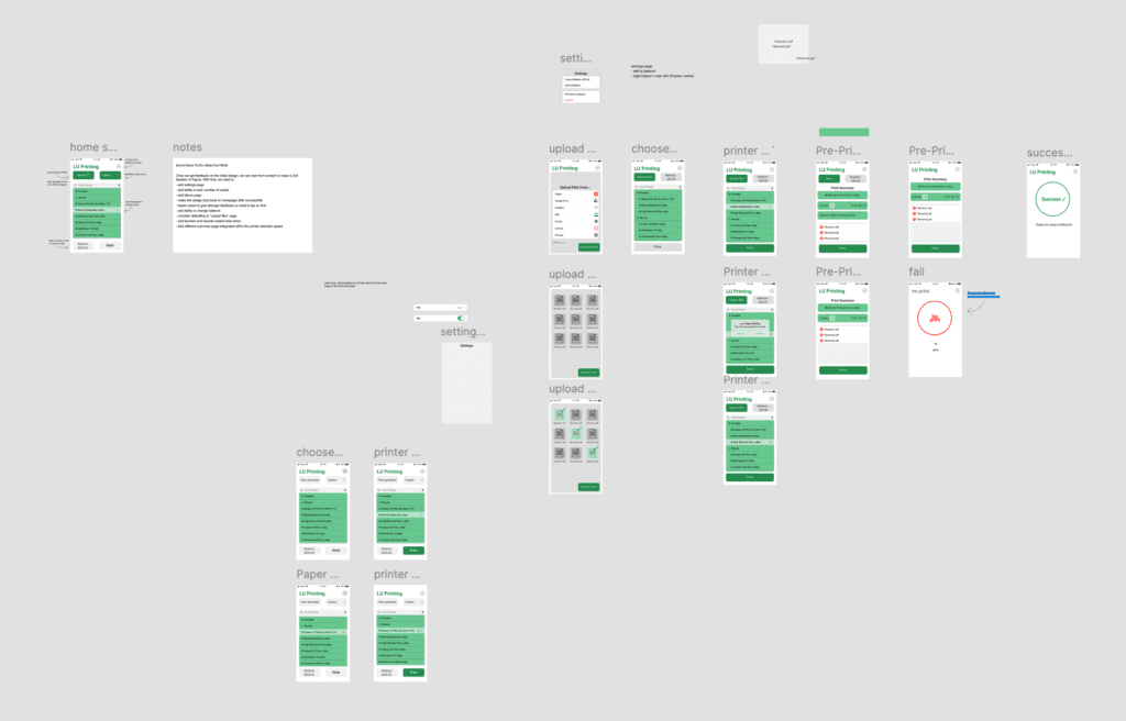
Iteration Process
After our research and analysis phase, we repeated the following process for multiple iterative rounds:
- Review previous feedback
- Sketch new interface design ideas on paper
- Create or modify the previous wireframe mockup
- Implement new features and constructive changes, based on prior feedback
- Add details and visual polish
- Test our design prototype on-device, noting any issues or mistakes
- Receive feedback from other students and our professor
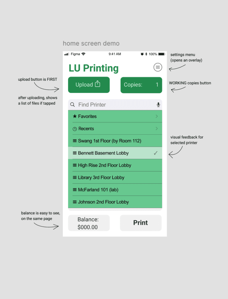
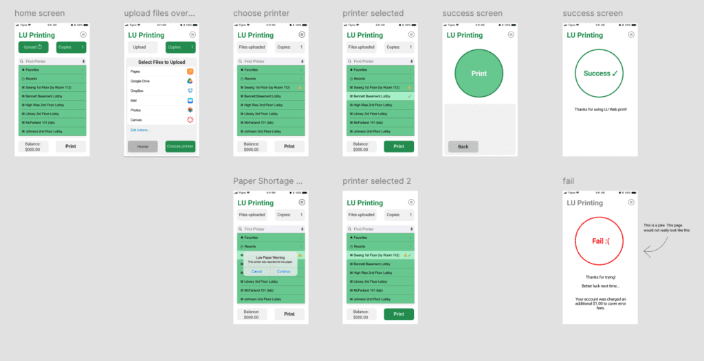
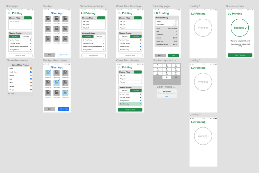
With each iteration, our design became more streamlined and easy to navigate. We learned from our mistakes in earlier versions–by combining two of our app’s pages, we greatly reduced the friction and cognitive load of using our interface.
We also positioned items to guide users’ eyes to the next steps, and we used our color palette to strategically provide feedback and show users the next step.
It’s quite evident that as we learned more and more UI Design concepts in class, we took even bigger steps in our improvements.
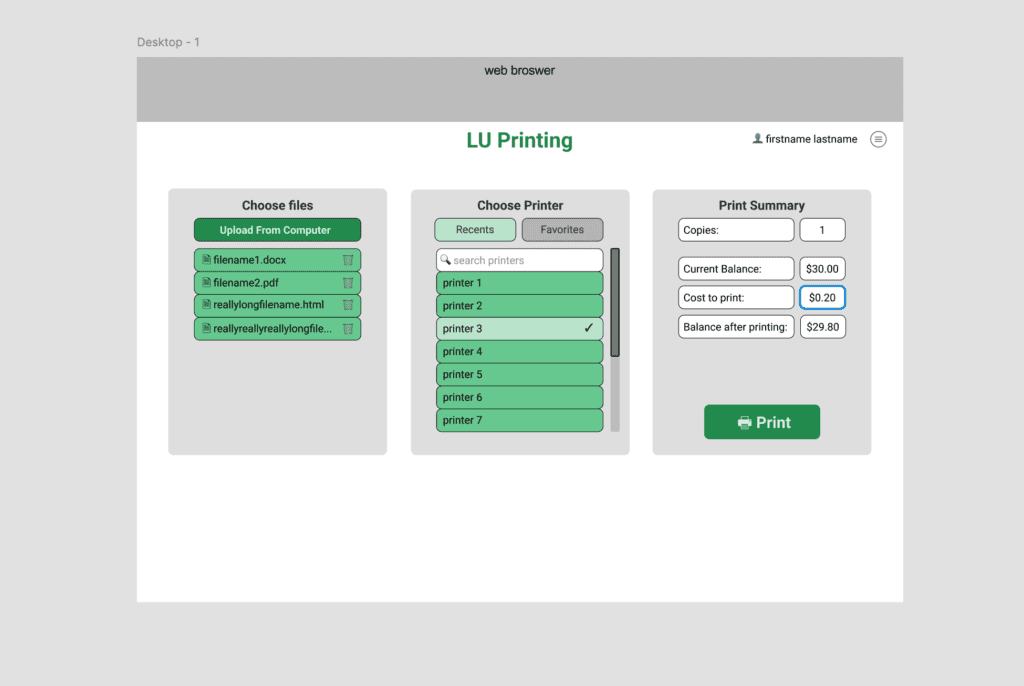
Desktop Version
After we wrapped up our second-to-last mobile iteration, we designed a desktop version of the app as well, taking many cues from our mobile mockup.
At this point, we were approaching the end of the semester, and it was time to go full steam and put a wrap on this project before exam week.
Throughout our last few weeks, we simultaneously worked on the finishing our final mobile mockup in Figma and on building a desktop demo version, which incorporated HTML, Bootstrap styling, and jQuery scripting.
Since our group had varying levels of familiarity with Web Development, I worked closely with another experienced teammate to create the desktop demo.
Around this time, we were now putting the finishing touches on our Figma mockup, preparing for our final presentation and feedback session.
The Results
After weeks of iterating changes and endlessly tweaking things, our hard work paid off.
We finished the semester by completing our interface redesign, with a Figma mockup for mobile devices and a working demo for desktop computers.
This project was a massive learning experience for applying UI/UX concepts, and for leading a team.
Lessons For the Future
Even better would be the chance to focus more on research methods, as mentioned above. This definitely seemed to be the most lacking part of the project, mostly due to the limited resources and time available, and the mostly visual focus of the class.
Additionally, it would have been great to incorporate qualitative analytics data to more easily test and validate design decisions. Making sense of analytics data is one of my favorite challenges, but this was not possible for our project since we did not have access to the original print app.
However, all things considered, this project was a foundational learning experience, offering a great opportunity to incorporate many critical design skills in a real-world setting.


